A new look for my website and blog

I've given my website and this blog makeovers. They're small changes, but they're all I've got time to implement right now. Still, I think they look better than they did before, and now they both use the same colour scheme, for a more integrated feel.
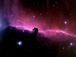
(The astronomical background images are pieces out of the Horsehead Nebula.)
The Robert J. Sawyer Web Site


0 Comments:
Post a Comment
Subscribe to Post Comments [Atom]
<< Home